Design System
Designing scalable systems that improve usability, accessibility, and consistency across digital financial experiences.
Overview
PC Financial’s mobile app and secure site were evolving rapidly, but inconsistent interaction patterns and component behaviors led to fragmented experiences across platforms.
As a Product Design Co-op, I contributed to the design system by improving interaction clarity, accessibility, and scalable component patterns across mobile and web.
The Challenge
As digital banking products evolved across teams, similar workflows were being designed independently, resulting in inconsistent page structures, interaction patterns, and content organization.

Inconsistent Patterns
Different teams solving the same problems differently.
Duplicated Effort
Repeated layout and component creation.
Difficult to maintain consistency across products.Scaling Issues
Why it Matters
For Users
Inconsistent Experiences
Users encountered different navigation structures and interaction patterns across similar workflows.
Increased Cognitive Load
Users had to repeatedly learn new layouts and behaviors for familiar tasks.
Reduced Confidence
In financial experiences, inconsistent feedback and page structures could create uncertainty during critical actions.
For Designers:
Repeated Work
Designers recreated similar page structures and interaction patterns across projects.
Slower Delivery
Time was spent rebuilding solutions instead of focusing on user problems.
Lack of Shared Standards
Teams interpreted layout requirements differently, leading to fragmented experiences.
Developers:
Ambiguous Handoff
Without clear standards, implementation became more difficult and error-prone.
Inconsistent implementation across platforms
Similar experiences required different development approaches.
Higher Maintenance Costs
Multiple layout variations increased complexity and maintenance effort.
Design Goal
To address these challenges, the framework was guided by four principles:
Consistency
Create predictable experiences across products.
Scalability
Support future workflows without redesigning layouts.
Flexibility
Allow teams to adapt content while maintaining structure.
Accessibility
Promote inclusive experiences aligned with WCAG standards.
My Role
Audit Existing Patterns:
Reviewed components and flows across the mobile app and secured site to identify inconsistencies in interaction behavior, hierarchy, accessibility, and component usage.
This helped uncover opportunities to simplify experiences and improve system consistency across products.
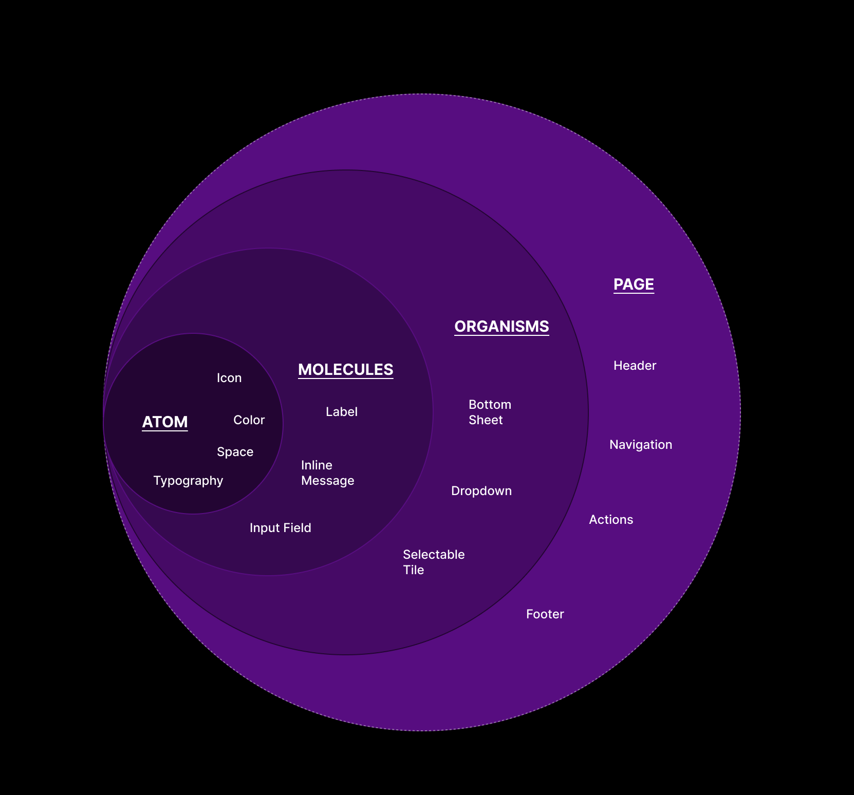
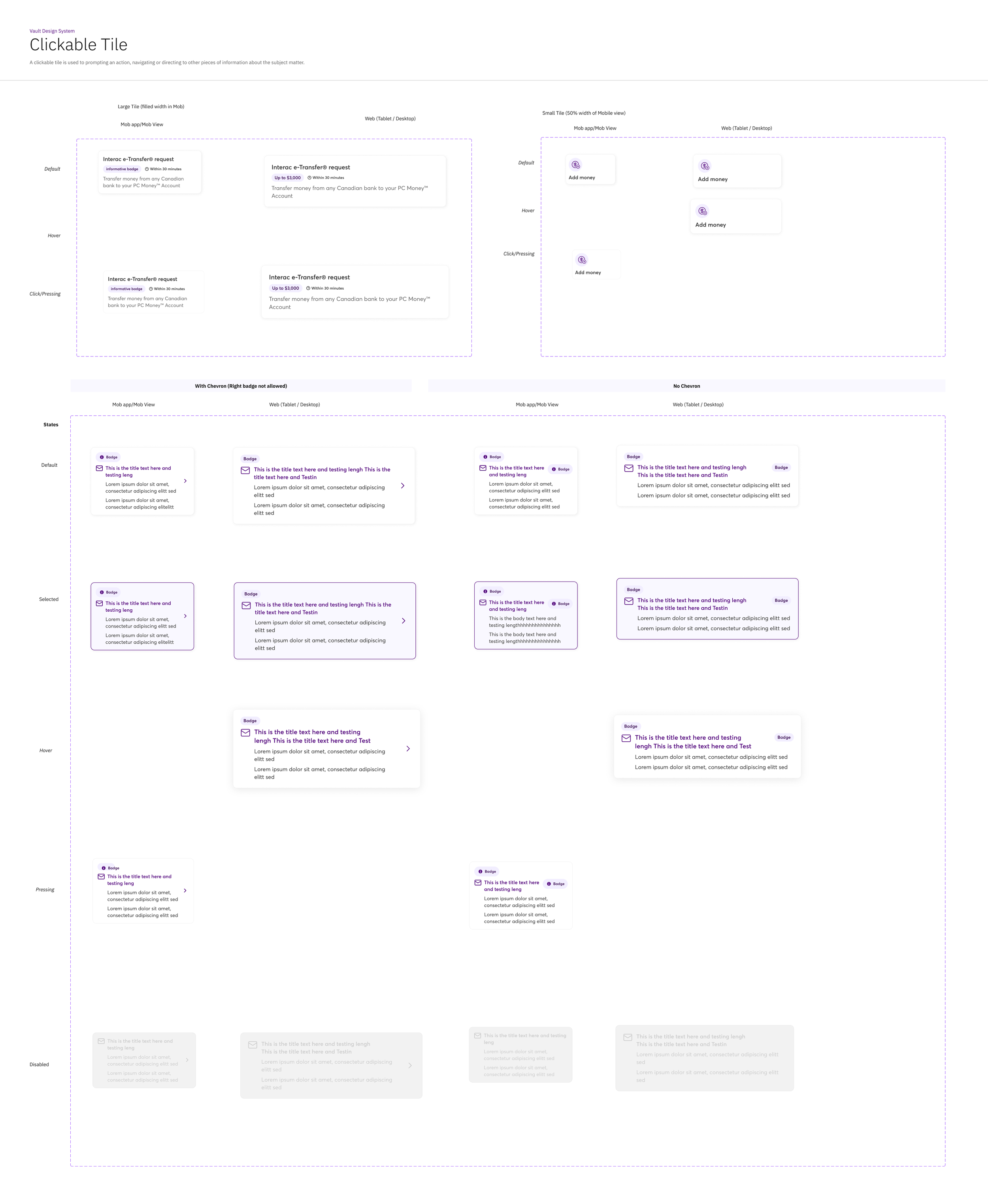
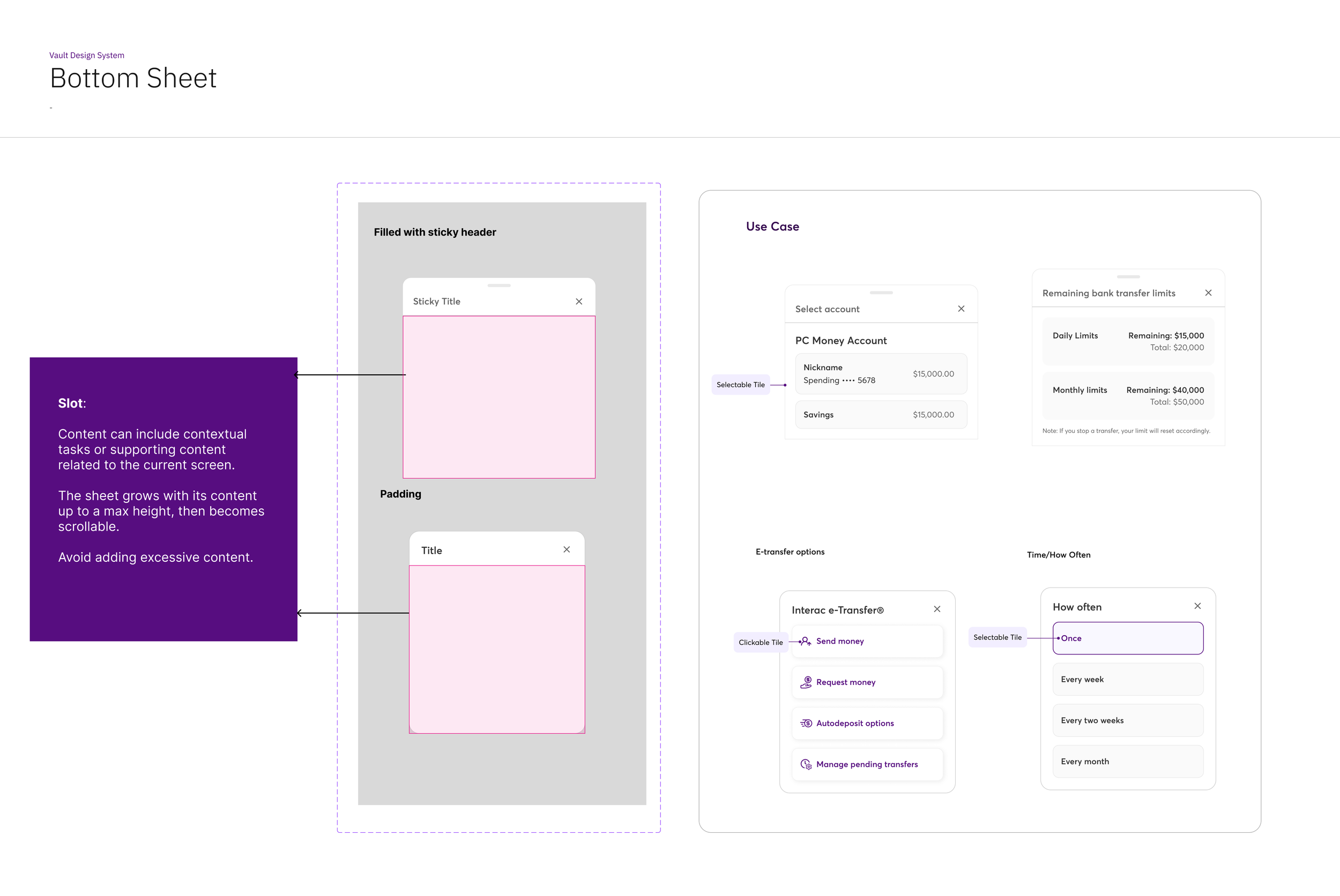
Build Reusable & Scalable Components:
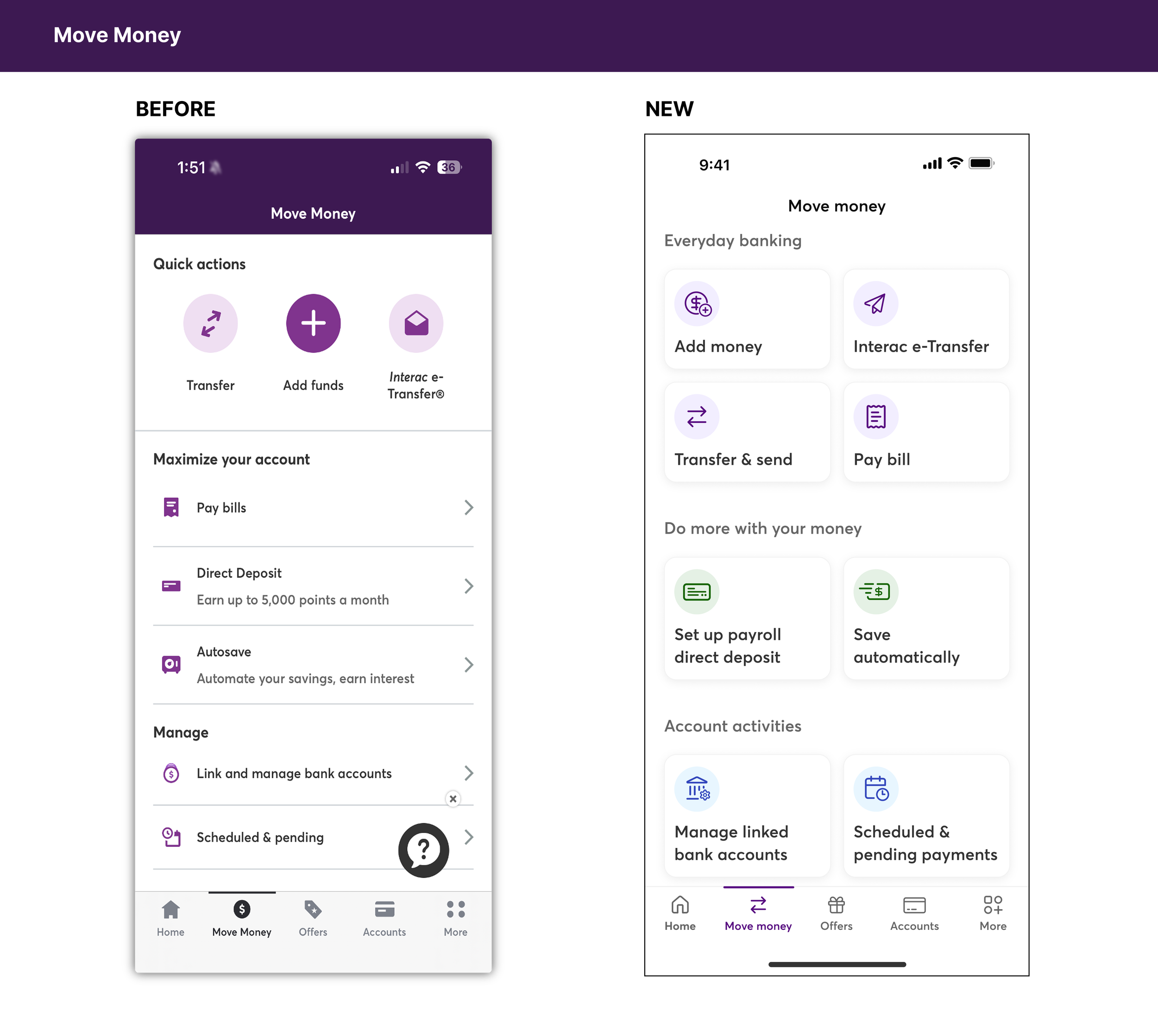
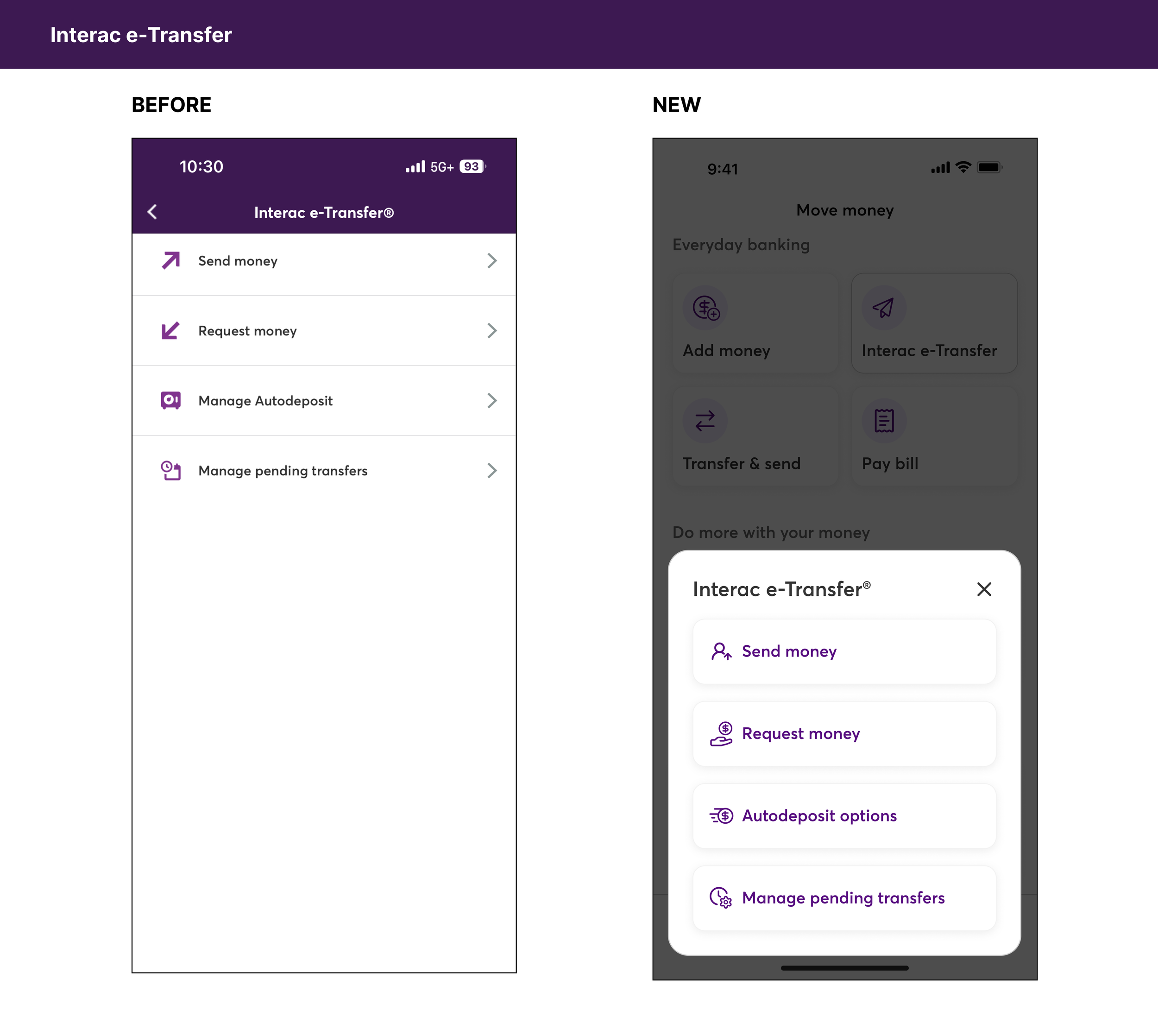
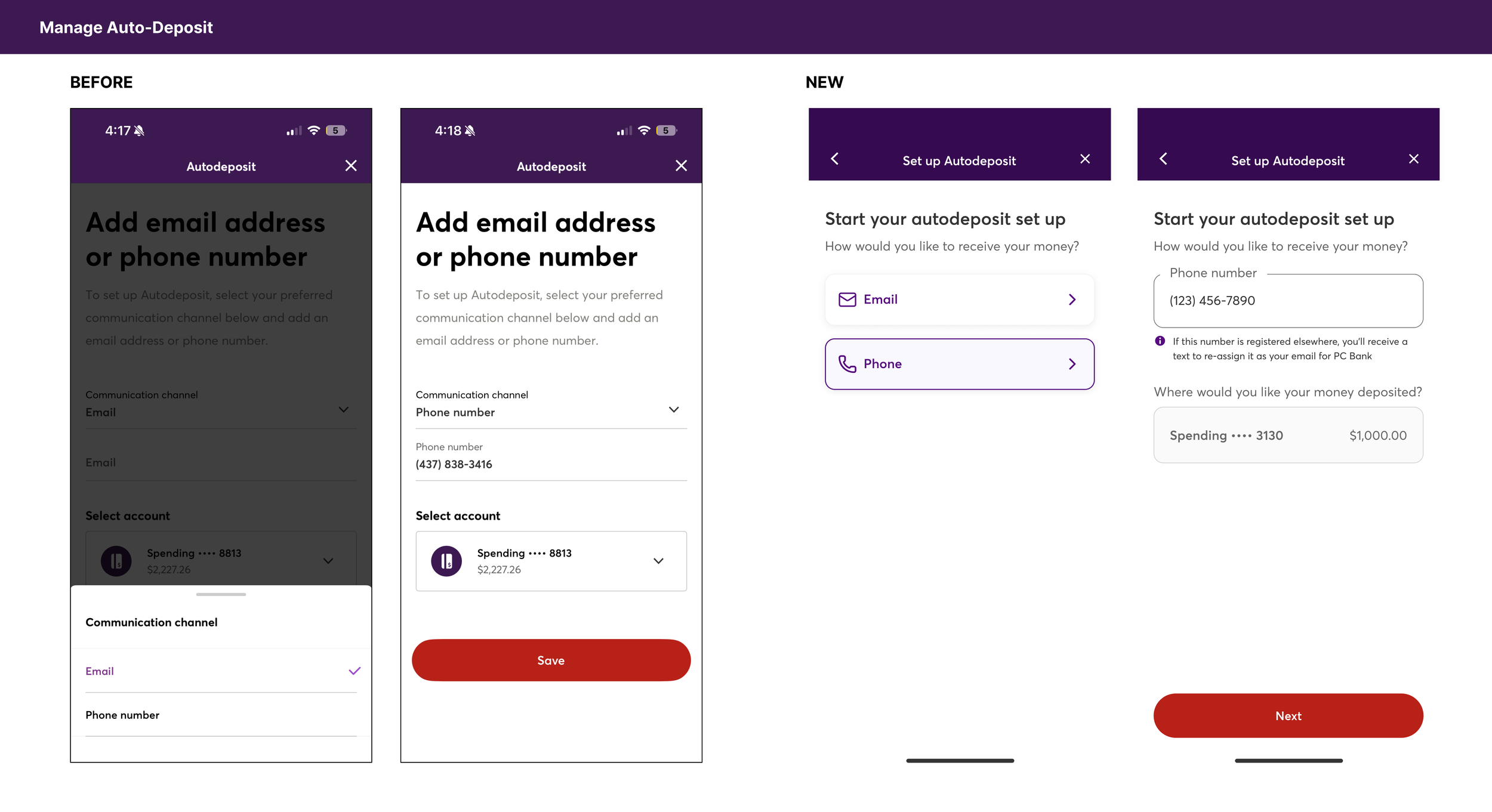
Collaborated closely with product designers during money movement redesign initiatives to explore emerging use cases and reusable interaction patterns across mobile and web experiences.
To support flexibility without compromising consistency, we introduced slot-based structures within components such as bottom sheets, allowing designers to adapt content for different workflows while maintaining standardized behaviors and layouts.
By integrating validated patterns into the design system and documentation, the team was able to:
Improve consistency across experiences
Reduce repeated design and development effort
Streamline cross-functional communication
Support faster and more efficient handoff workflows
Strengthen the long-term scalability of the design system
Design System Integration:
Refined key interaction patterns, including CTAs, text links, and content structure, to improve usability and reduce cognitive load during financial workflows. The focus was to create clearer, more intuitive experiences that support user decision-making.
Key Metrics
Clarity improved dramatically: Understanding of “Direct Deposit” increased from 30% to 100%, and users clearly understood “Set Payroll Direct Deposit.”
Zero selection errors: 100% of users chose the correct funding option on the Add Money page, indicating a very low error rate and strong comprehension.Clear error recovery: When shown an amount-related error caused by an incorrect funding rail, 100% of users understood why the error appeared and what action to take next.
New awareness unlocked: Previously, most users were unaware they could fund their account by setting PC Financial as a payee. Now, 72% recognized the option and expressed interest in learning more.
Reflection
Design systems are more than collections of components. They create shared foundations that help teams deliver consistent, scalable, and user-centered experiences. This project strengthened my ability to design systems that balance user needs, business objectives, and technical constraints across complex product ecosystems.