MaaTRx Redesign
Improving navigation, system feedback, and clinical information clarity for a healthcare AI platform.
Role: UX Designer
Timeline: Jan – Apr 2026
Client: MaaTRx × University of Toronto
Project Overview
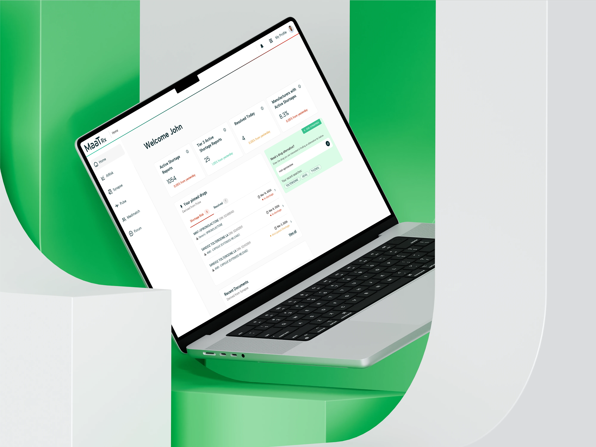
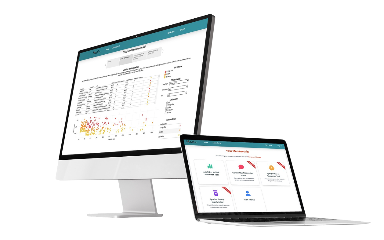
MaaTRx is a healthcare platform with multiple clinical tools. Our team focused on SynapseRx, a tool that helps healthcare practitioners identify drug alternatives during shortages.
The Challenge
Healthcare practitioners needed to compare multiple drug alternatives during medication shortages.
However, the selection process presented several usability challenges:
Information was difficult to scan
Relationships between drugs were unclear
Users struggled to review selected alternatives
Important actions were hard to find
These challenges increased cognitive load and reduced confidence during decision-making.
Research & Insights
Users struggled to understand how to enter the workflow
During usability testing, participants were unsure how to start searching for alternative medications.
“I actually don’t know what just happened... I was expecting a search bar... but it just brought me to Synapse.”
“I tried clicking the ‘Synapse’ option... it didn’t work, so I clicked the green box instead.”
Users were confused by the system language and actions
Several participants expected to find drug alternatives, but the interface instead emphasized document generation.
“I would like the call to action to start with something like ‘find alternative’ rather than ‘generate document’...”
“I don’t really know what ‘documents’ mean...”
Users lacked confidence when reviewing AI-generated recommendations
Participants were uncertain about the relationships between medications and wanted more transparency around AI-generated content.
“Is this like the parent drug?”
“I wonder if there needs to be a disclaimer that this is AI-generated.”
Design Strategy
Based on the research findings, I focused on three key design goals:
Guide users into the workflow
Reduce uncertainty by creating clearer entry points and contextual actions.
Support Confident decision-making
Help users review and compare alternatives without losing context.
Reduce cognitive load
Surface critical information and actions at the right moment in the workflow.
Visual System & Accessibility
Moodboard
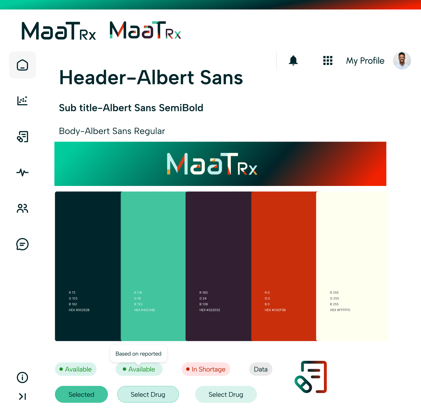
To create a more cohesive and trustworthy experience, I developed a visual language inspired by healthcare dashboards and clinical tools.
The visual system focused on:
Clear information hierarchy
Consistent component behavior
High readability
Professional and trustworthy aesthetics
WCAG Color Guide
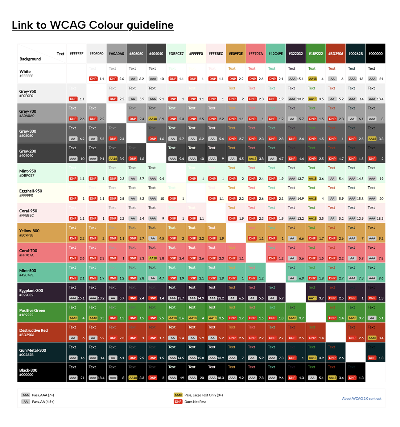
Accessibility was considered throughout the redesign process.
We established a WCAG-compliant color system to ensure:
Sufficient contrast ratios
Clear status communication
Consistent visual hierarchy
Better readability across clinical environments
Impact
A standardized visual system improved consistency, scalability, and accessibility across future product development.
Redesign Workflow
The redesigned flow introduced the following:
Clearer entry points
Progressive guidance
Better visibility of system status
Reduced uncertainty during AI processing
WHY IT MATTERS?
Users previously felt unsure about what the system was doing and whether their actions had been registered.
The redesigned workflow improves transparency and keeps users informed throughout the process.
Key Design Solutions
Guided Buttons
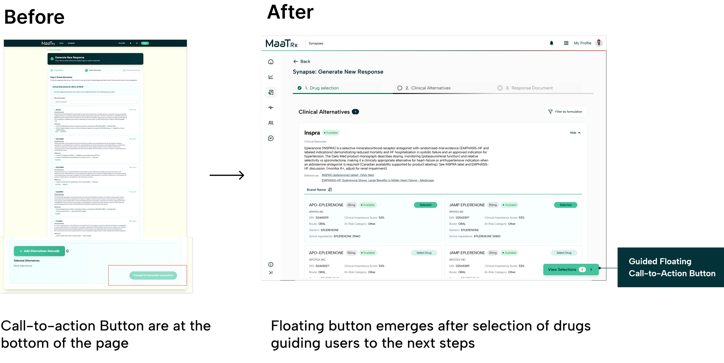
Problem
Users often missed critical actions because CTAs were positioned at the bottom of lengthy pages.
Solution
I introduced a floating CTA that appears after users make a selection.
Rationale
The CTA appears when users are ready to proceed, reducing the need to scroll and reinforcing the next step in the workflow.
Impact
Reduced navigation effort
Improved discoverability of key actions
Maintained user momentum throughout the workflow
Selection Blade
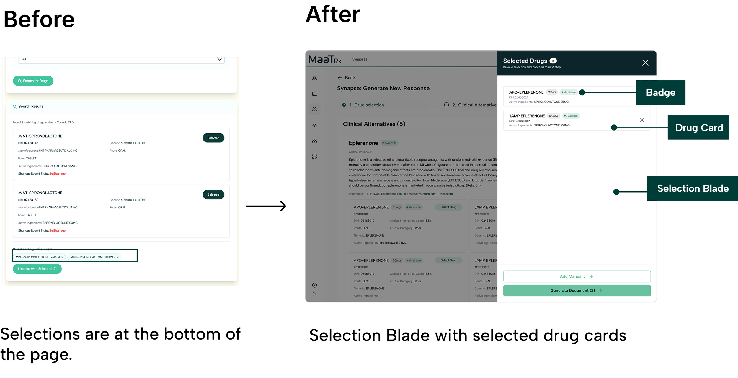
Problem
Selected alternatives were hidden at the bottom of the page, forcing users to scroll repeatedly to review their choices.
Solution
I introduced an in-content Selection Blade that provides a persistent summary of selected medications without disrupting the workflow.
Rationale
The Selection Blade allows users to:
Review choices in context
Compare selections more easily
Stay within the current workflow
Confirm decisions before generating a document
Impact
By reducing context switching and keeping critical information visible, the Selection Blade lowers cognitive load and supports more confident decision-making.
Design Outcomes
Improving Workflow Clarity
Improved workflow navigation through guided interactions, clearer entry points, and enhanced system feedback.
Helped users better understand where they were in the process and what actions to take next.
Supporting Decision Confidence
Increased confidence when reviewing alternative medications through improved transparency, contextual guidance, and clearer information hierarchy.
Created a more structured experience for high-stakes clinical decision-making.
Reducing Cognitive Load
Reduced context switching by introducing in-content selection interactions and surfacing critical information at the point of decision-making.
Simplified complex workflows into more manageable and predictable steps.
Client Impact
Received positive feedback during the final presentation, with strong interest from the client in adopting several workflow and interaction design recommendations.
Key areas of interest included the Selection Blade interaction, guided CTA patterns, workflow restructuring, and accessibility improvements.
Reflection
Designing operational tools is less about engagement and more about supporting confident decision-making.
Small changes in interaction can significantly reduce cognitive load in complex workflows.
Research becomes most valuable when it directly informs workflow and system-level design decisions.
Early user validation helps uncover assumptions before they become design constraints.