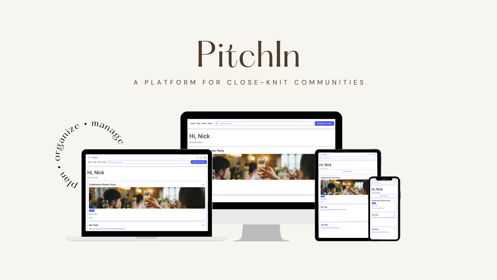
UI Case Study: PitchIn - Collaborative Event Planning
Problem Statement
Small groups often struggle with unclear task assignments, last-minute changes, and unclear responsibilities when planning events. Communication becomes fragmented, and key steps (like meal collection or reimbursements) are frequently missed.
Target Audience
Small communities (10–50 people) such as sports teams, interest clubs, or professional societies
Goal
Design a platform that enables transparent, equitable task assignment and intuitive coordination, allowing all members to contribute without top-down management.
Context
This was a solo UI design project developed for a university course, targeting small communities (e.g., sports teams or clubs) that self-organize events, such as dinners or tournaments. Deliverables included user research, high-fidelity UI, and usability testing.
My Role
Sole UX/UI Designer
Led end-to-end design
Created task flows for assignments and reminders
Designed and tested a responsive UI in Figma
Conducted usability testing and iterations
The Team
Solo project with usability feedback from 4 non-design professionals in marketing, finance, arts, and design.
User Flows
✅ Task 1: Assign Event Responsibilities

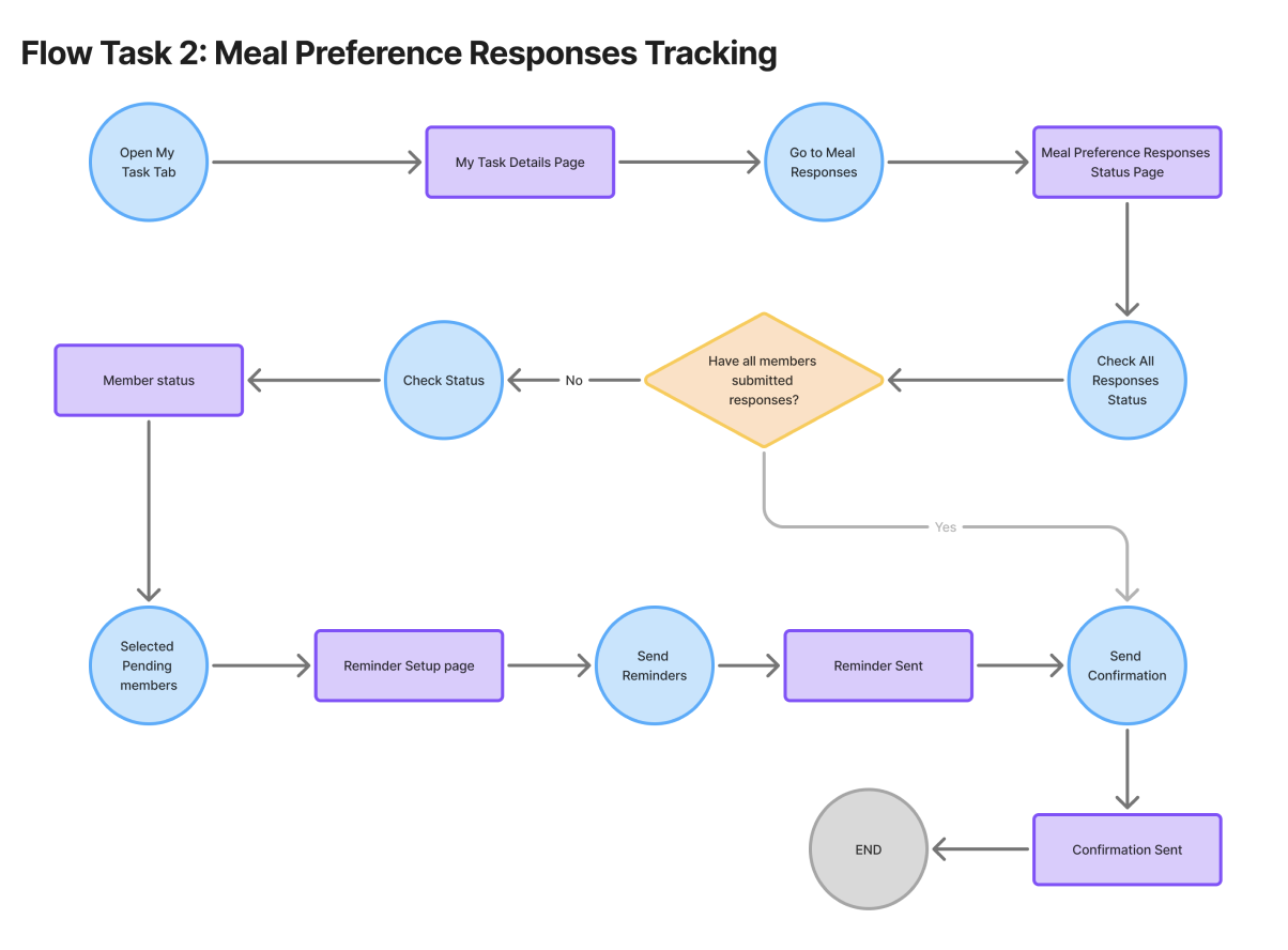
✅ Task 2: Track Meal Preferences & Remind Members
Visual Design System
Keywords: Collaborative, Supportive, Organized, Welcoming, Friendly, Joyful


Color Palette: Primary blue for reliability (#3953F9), with energetic accents (orange, green, purple) to evoke creativity and inclusiveness.
Typography: Roboto for clarity, friendliness, and digital-native readability.
UI Styling: Rounded buttons, clear hierarchy, and soft shadows create a warm, accessible interface.
Imagery: Community-based, expressive photos and illustrations that feel real and energizing.


Components
Header & Navigation: Compact, accessible top bar with search and quick action icons.
Buttons: Primary and secondary states, including contextual indicators like “Pending” and destructive actions like “Delete.”
Icons: Status and utility icons sourced from Iconify, styled for clarity and accessibility.
Switches: Custom toggle visuals for response status and role selection.
Task Cards: Modular layout with integrated member status, deadlines, and quick actions.
Form Inputs: Simple, intuitive fields for entering names, emails, and preferences.


Responsive Design
PitchIn uses a mobile-first, responsive layout with a 4-column grid. Key features such as task lists, reminders, and meal tracking are optimized for clarity and usability across all screen sizes.

🔍 Insights from Testing & Peer Critique
Four participants from different professional backgrounds conducted user tests and identified key pain points related to visibility, task clarity, and feedback. Meanwhile, peer reviews also emphasized UI such as screen overload, the lack of status indicators, and ambiguous error messages.
““It looked clean and easy to navigate at first glance.”
“Tracking who submitted meal preferences was a bit confusing. I had to click around to find it.””
“I wasn’t sure if my task was really assigned. The ‘Completed’ button didn’t give me enough feedback. And I wasn’t sure what ‘Set Reminder’ and ‘Send Reminder’ meant—are they for me or for others? ”
“What should I do after send the reminder? Check the status button again?”
“I’d make the meal tracking section more visible or easier to find.”

Design Iteration


Reflections
-
Designing PitchIn showed me how important clear and easy-to-use interfaces are in teamwork tools. It was important to find the right balance between giving users freedom and keeping things organized, especially for groups without a leader.
-
Usability testing showed that small UI details, like clear feedback and task status, can strongly affect how confident users feel. This project reinforced how thoughtful design can reduce friction and make teamwork feel more equitable.