Ensure a calm,
on-time travel journey at airport
Airport Navigation with timely changes and updates
Project Summary
Problem Statment
“Frequent travelers often feel stressed and overwhelmed by long security lines and unclear gate information at airports, leading to missed flights and anxiety.”
Goal
“Reduce this frustration and support travelers in navigating the airport environment more efficiently, helping them feel informed and on track as they move toward their destinations.”
The Context
Course project for a Master’s level Fundamentals of UX course
My Role
Conduct usability tests with two professional participants.
Prioritize the solutions and iterate designs based on user feedback to meet their needs.
Contribute to wireframe design, UI mockup, and user flow development.
The Team
Yongxiu Guo, Jingyu Liu, Katy Lei, Peijia Li, Jiayi Xu, Ziyi Zhai, Ruyi Zhang
Overview of Project Stage
-
User Research
Conduct user research including interviews, data organization, user profile, and identified users’ main pain points.
-
Ideation & Iterations
Brainstorm potential ideas, prioritize the most impactful and feasible solutions for users, and conduct usability testing to gather feedback. Refine and iterate on the wireframe.
-

Design
Create Moodborad and style tile as guides to develop an aesthetic app mockup with UI designs.
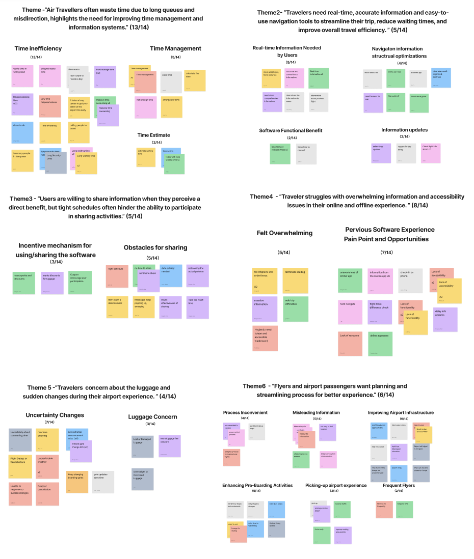
User Research
To understand what truly frustrates travelers, we interviewed 14 frequent flyers and mapped out their airport journeys—from check-in to boarding.
We expected complaints about security lines. Instead, we uncovered something deeper: confusion caused by too much information, not too little.
I helped synthesize this into key user insights, personas, and journey maps.
What we saw repeatedly was this pattern:
“I don’t know where to go—not because there’s no info, but because there’s too much of it.”
What travelers told us
“Gate changed, and I missed the announcement.”
“I wasted 10 minutes walking the wrong way.”
“There’s too much info, and I can’t process it fast enough.”
Meet Julia-The Frequent Flyer
Julia is a 30-year-old business consultant based in Toronto. She travels 3–4 times a month, and values planning, punctuality, and smooth transitions. She’s a confident, seasoned flyer—until she isn’t.
“The moment I see a gate change notification, I panic. I just want someone to tell me where to go next.”
For Julia, the airport isn't intimidating—it's the flood of inconsistent, fast-changing information that makes her feel lost. She doesn’t need more data; she needs clarity, timing, and a sense of control.
This insight shaped our design direction: we weren’t just creating a map—we were building confidence in motion.

Pain Points
Lack of clear wayfinding
Stress from unexpected gate changes
Limited time for detours and re-navigation
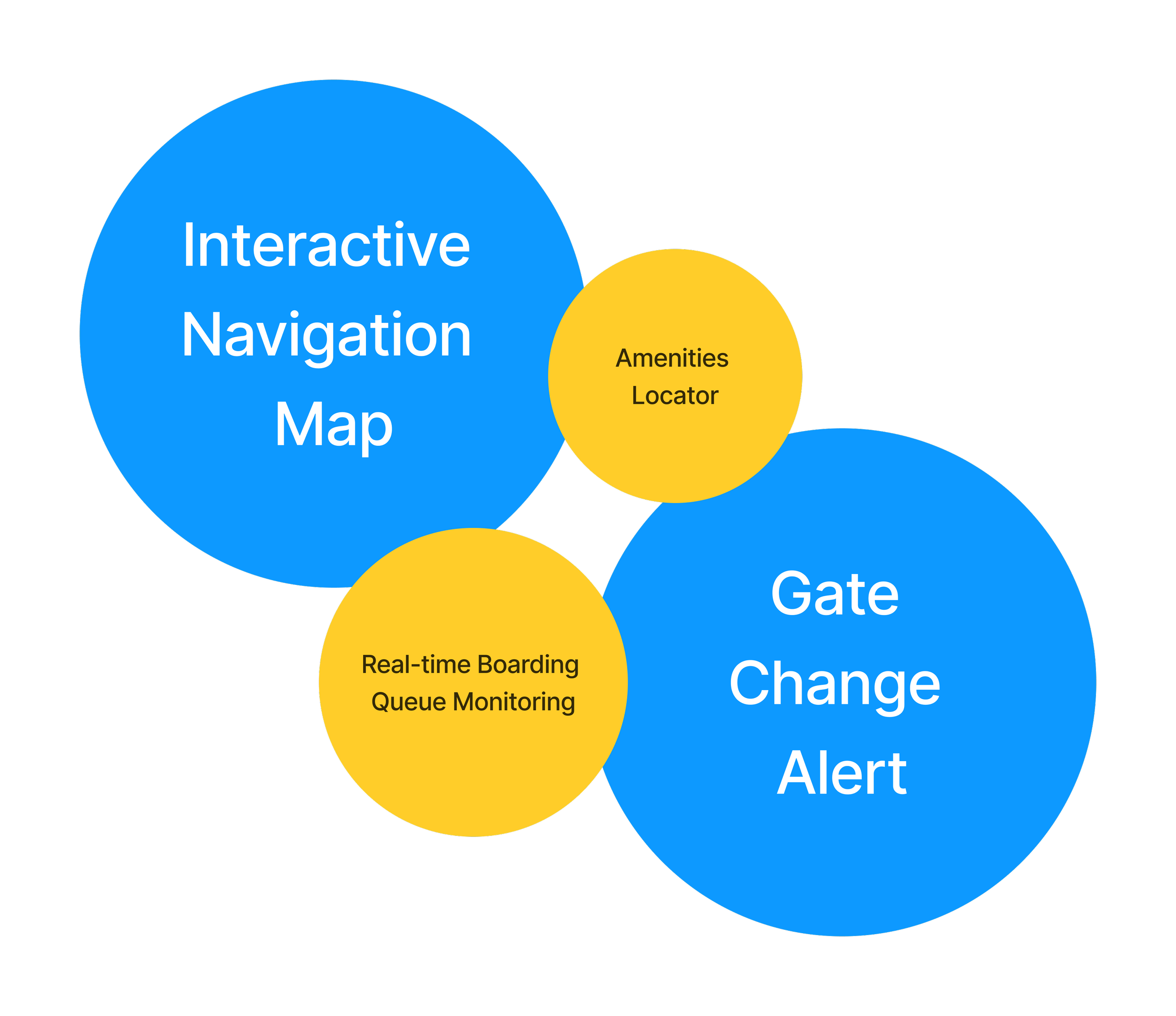
Opportunities
Enhanced Navigation
Real-Time Updates and Alerts
Arrival Confirmation
Turing Frustration Into Focused Features
With the top user pain points in mind—missed gate change alerts, overwhelming signage, and time uncertainty—we began brainstorming feature ideas that could directly address those challenges.
We sketched out a wide range of possible features: from loyalty rewards to queue monitoring, to personalized navigation systems. But we kept asking ourselves:
“Which ones actually reduce stress?”
“Which ones help users make a confident decision, fast?”
Through a team-wide impact-effort matrix, two ideas clearly stood out as “quick wins”:
Real-time Gate Change Alerts
Interactive Navigation Map with Time Guidance

What we chose, and why:
Alerts reduce decision delay.
Maps reduce wayfinding confusion.
Time estimates reduce panic.
We mapped out a user journey based on these two features, ensuring a seamless “happy path” experience: from the moment a gate change to the moment a user arrives, calm and on time.
Usability Testing & Iteration
The UX team conducted peer usability tests, and I conducted usability evaluations with two professional users to assess the prototype’s clarity, ease of navigation, and task completion efficiency. The goal was to reduce cognitive load and improve user experience during boarding gate changes.
Testing the Calm: Does It Work Under Pressure?
Once we had a working prototype, we tested it with two professional users, travelers who had personally experienced airport stress.
We focused on three goals:
Could they quickly understand the alert and act on it?
Did the navigation feel intuitive under time pressure?
Did they feel more in control than with the current airport tools?
🗣️What We Heard
“I like that system. It tells me what changed, but the wording made me panic.”
“I was not sure what icon meant, such as route options, so I clicked the wrong thing.”
“I wish it would just tell me if I am on track.”
This Feedback showed us that information clarity is not just about what is shown, it’s about how it feels
🧭 What Changed

Alert Popup Content:
Revise "Gate change alert" messages to use neutral, supportive wording.
Redesign caution icons to reduce anxiety.
Display map route options directly in the alert to minimize clicks.

Enhance Features:
Add captions or replace ambiguous icons with descriptive labels like “route options” or “change route.”
The navigation bar has been updated with more visual hints and dynamic features to enhance user interface interaction.

Captions Adjustment:
Update flight info page captions to guide users more effectively.
Modify font size and color for better readability and emphasis on key details.
Translateing Research into Visual Clarity
Based on what we heard from users—stress from gate changes, overwhelming signage, and the fear of running out of time—we shifted our creative goal: every screen should reduce uncertainty, not add to it.
I contributed to multiple design layers, starting with:
A flow map to visualize how users move through the app
A mood board and style guide to anchor our tone: calm, efficient, supportive
Two UI mockups to test layout clarity with the team
After user feedback and internal critiques, I refined the prototype flow and introduced a new page that offers route options more proactively, ensuring travelers always know their next step.
We weren’t just designing screens. We were shaping how the interface makes people feel in moments of pressure.
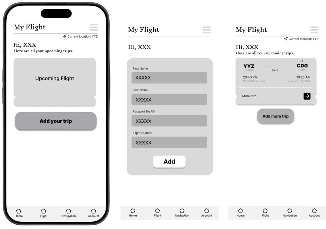
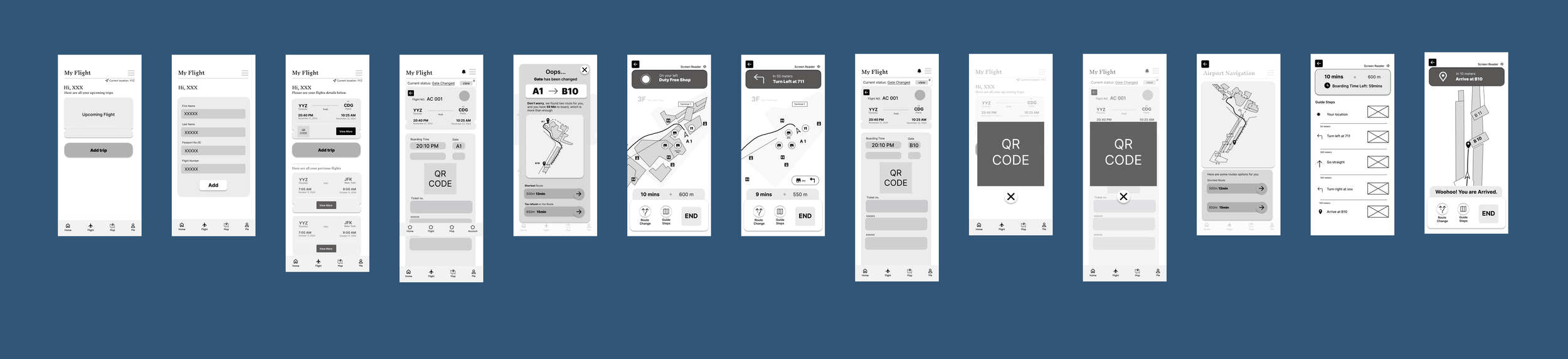
Wireframes
Updated Mood Board & Style Tile


To establish a visual language that feels calm yet confident, we created several mood boards and iterated on our color and typography choices.
We selected a soft blue as the primary color to evoke a sense of calm and stability, essential in high-stress airport environments. This was paired with accents of yellow and green to introduce friendliness, clarity, and wayfinding energy, while a touch of red was used sparingly to signify urgency without triggering anxiety. We adjusted the font thickness and size, separating the main operations from the auxiliary details to ensure readability and hierarchy.
Sequential Storyboard
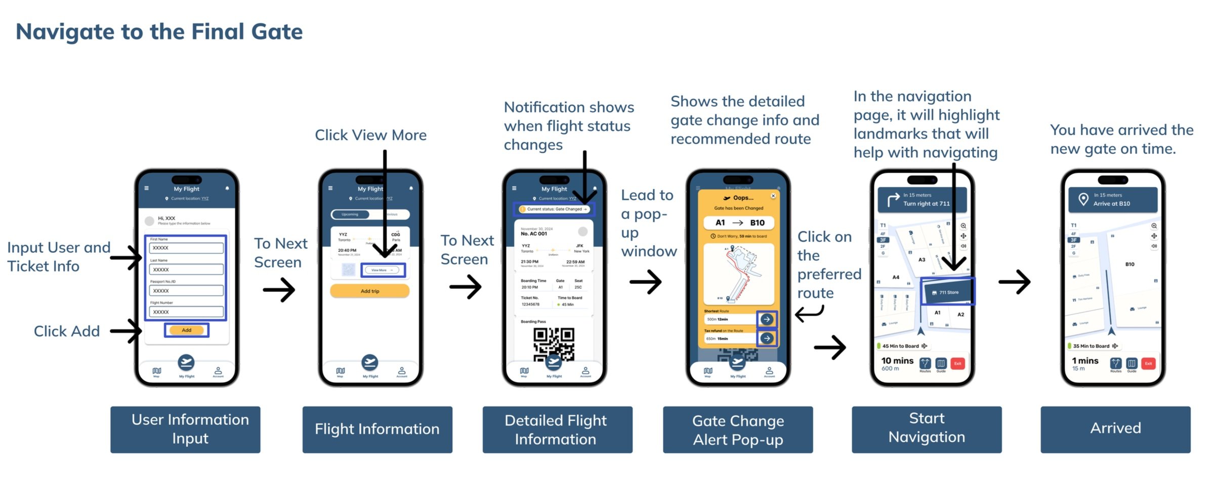
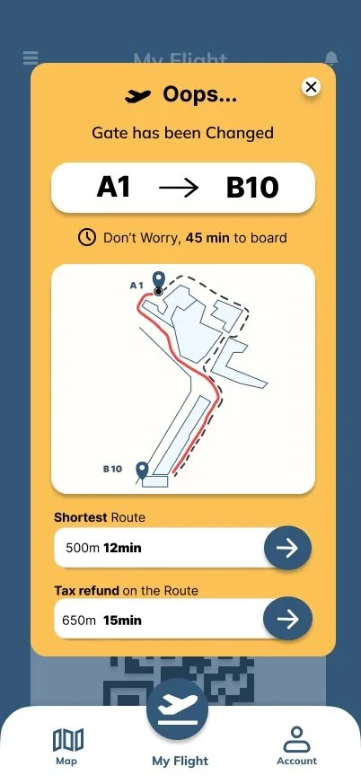
🟨 Gate Change Alert Screen
When a gate changes unexpectedly, users don’t need to panic or search, this screen instantly shows the updated gate, the time left to board, and two clear route options.
We designed it to reduce stress at the exact moment confusion usually peaks.
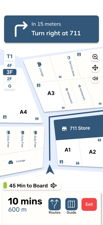
Instead of abstract arrows or technical floor maps, we used recognizable landmarks and real-time instructions to guide users visually.
The map adapts based on location and uses subtle color cues to reflect walking time and density, helping users move with confidence.
🗺️ Landmark Map Direction Screen
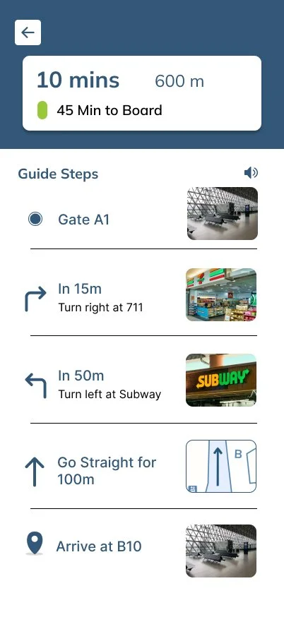
📍 Guide Steps Screen
This screen breaks the journey into clear, bite-sized steps, each paired with a visual cue and distance estimate.
It's built to answer one simple question:
“Am I still on the right track?”
Reflections
🤝 Value of Teamwork
Working with a diverse team pushed me to listen more attentively, adapt more quickly, and communicate my ideas more clearly.
We each brought different strengths, including data visualization, usability thinking, and task flow logic. By combining them, we created a solution far more thoughtful than any of us could have built alone.
I learned how to actively listen, give and receive feedback productively, and respect different working styles and priorities.
🧠 Problem-Solving
Throughout the project, we had to reconcile user desires with technical feasibility. I helped break down complex problems into manageable design decisions, often asking:
“What’s the simplest version of this that still solves the user’s stress?”
I also contributed to evaluating which features delivered the most value under real constraints, prioritizing clarity over complexity, and practicality over perfection.
🚧 Improvement
Start feedback loops earlier to reduce rework and second-guessing
Create space for open dialogue when team ideas diverge
Be more proactive in facilitating tough discussions around scope and feasibility
Set up more frequent alignment check-ins, especially in fast-paced sprints